Understanding Color Theory & Color Mixing

Technically, drawing in colored pencil is about layering semitransparent colors on paper to create vivid paintings. Layered hues produce fresh, exciting surfaces. It’s always best to mix at least two colors in any given area, rather than drawing with a single pencil. I’m attracted to intense colors and burnishing makes them even brighter (the mineral spirits melt the wax in pencils, darkening and smoothing the surface). At the same time, burnishing is optional.
My painting must have many color combinations but the surface doesn’t have to be burnished to create a successful image. I always get to know my new colors by mixing them with its complements and any other colors I think will be useful to have at a glance. Artists should create a palette of these new color combinations on paper and keep it handy to be aware of the possibilities.
There are three qualities about every color: temperature, intensity, and value. I will explain the color properties in this chapter. The combination of these three qualities gives paintings an illusion of depth and form. It also sets the mood for the picture. It is joyful with reds and yellows and melancholic with blues and violets. I strongly suggest not being afraid of using a variety of color mixtures.
Colored pencils are a very forgiving medium and unlike watercolor painting, it’s impossible to produce dull, wishy-washy grays and browns (that’s why Prismacolor Company manufactures gray pencils in both cool and warm temperatures to reduce the color intensity, if necessary). To sum up, here are several advantages of color mixing as opposed to single-color use.
List of Terms Used in This Chapter
Beginners see only local colors in objects and resist seeing the combination of colors. The student sees a green apple and he draws it with one green pencil. (The local color is green). First, think of greens more creatively. Find both yellowish warm greens and cooler blue-greens in a fruit. Second, there is a rule of applying local colors over the complementary hues to create a rich surface and to lower its intensity. The complement of green is red. Apply a bit of red under the green in the apple and see what difference in color it creates.
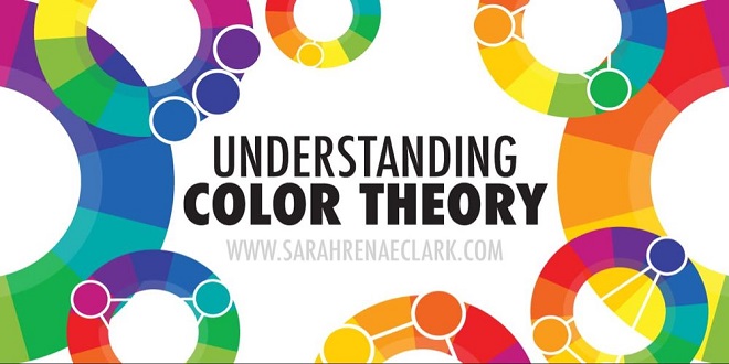
Complementary colors or complements – are colors that are across from each other on the color wheel, like yellow-violet, green-red, and blue-orange. Use complements to neutralize some colors that don’t describe the center of interest. Beautiful drawings show the balance between the intense and subdued hues
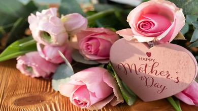
Intensity – is the saturation and purity of a color in relation to another color. In this picture, pure red (high-intensity color) is bright relative to pink (medium-intensity red), but pink is still quite bright relative to grayish light pink (low-intensity red). A white lily is very bright relative to green leaves, but green leaves are also bright relative to brown water in a still life.
The saturation or intensity of a very bright drawing can be easily controlled by applying a small amount of complementary color over its pure hue. Knowing that the bright colors advance and the dull colors recede, I often use the bright colors in the focal point and the duller hues in the background. Neutralized color – means less intense color, either grayed or mixed with its complement. “Blue” can be mixed with “Orange” to reduce the intensity of “Blue.” “Blue” chroma can be also grayed with a “Gray” pencil to do the same.


